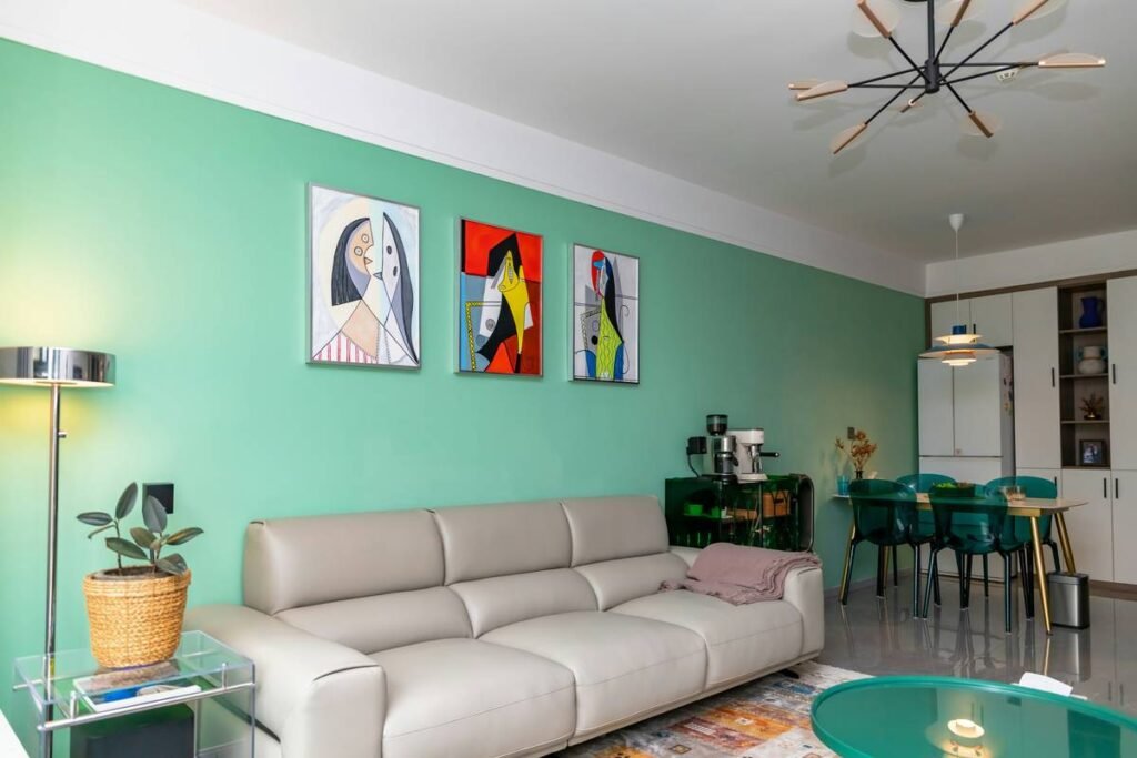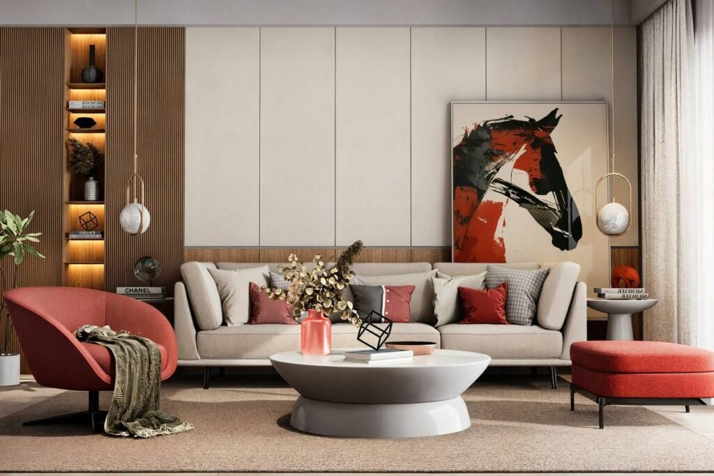
Your walls feel dead. Not cracked or peeling—just lifeless. Like they’re waiting for something that never arrives. You’ve tried family photos, generic landscapes, even that motivational quote print from 2017. Nothing sticks. The problem isn’t your taste—it’s that you’re decorating with intent but no strategy. Abstract wall hanging decor changes everything. Not because it’s trendy (though it is), but because it operates on emotional frequency, not visual literalism.
Why “Matching the Couch” Is Killing Your Space
Most people treat wall art like a throw pillow extension—something that must “coordinate.” That mindset guarantees mediocrity. Abstract pieces don’t match furniture; they anchor mood. A muddy beige room with taupe curtains doesn’t need more beige. It needs contrast, tension, energy. Yet homeowners keep playing it safe, ending up with what designers call “decorative wallpaper”—art so inoffensive it disappears.
And here’s the kicker: cheap mass-market abstract prints amplify the problem. They mimic texture without presence. No depth. No intention. Just pixels pretending to be pigment.
How to Choose & Hang Abstract Wall Hanging Decor That Actually Works
Forget random online purchases. This isn’t about what *looks cool* in a thumbnail. It’s about spatial resonance.
Step 1: Audit Your Room’s Emotional Temperature
Cool grays and minimalist furniture? Lean into warm-toned abstractions—ochres, burnt siennas, deep teals. Overheated rooms full of reds and golds? Go monochrome or icy blue palettes. The art should counterbalance, not echo.
Step 2: Scale Like a Pro, Not a Pinterest Scroller
A common mistake: tiny art over a massive sofa. Rule of thumb? The piece should occupy ⅔ to ¾ of the furniture width below it. Ceilings under 8 feet? Avoid vertical compositions—they’ll make the room feel shorter.
Step 3: Lighting Isn’t Optional—It’s Part of the Art
Matte finishes vanish in dim corners. Glossy surfaces glare under LEDs. Test before committing. Natural north light? Perfect for subtle textures. South-facing glare? Pick pieces with bold contrast that cut through brightness.
| Placement Zone | Ideal Abstract Style | Avoid At All Costs | Lighting Tip |
|---|---|---|---|
| Over sofa (living room) | Horizontal triptych or single wide canvas (48″+) | Small framed prints stacked randomly | Use wall sconces at 30° angle to create depth |
| Hallway / narrow space | Vertical linear abstraction (thin, tall panels) | Chaotic splatter pieces | Recessed ceiling spot focused 6″ above top edge |
| Dining area | Earthy tones with organic shapes (ochre, olive, slate) | Neon or high-saturation pop art | Warm white pendant 24″ above table, not direct on art |

The Industry Secret: Texture > Color (Every Time)
Here’s what no one tells you: in abstract wall hanging decor, texture dictates perceived value more than color or composition. A $99 print on flat paper reads as disposable. The same image printed on gallery-wrapped canvas with impasto gel layers? Suddenly feels heirloom-worthy—even if it’s not. Galleries know this. That’s why they charge 3x more for “mixed media” editions that add tactile dimension. You don’t need real paint buildup. But you do need surface variation. Look for giclée prints with textured coating, or canvas wraps with visible weave. Run your hand over samples before buying online. If it feels like a poster? Walk away.
And consider this: textured abstracts absorb and scatter light differently throughout the day. Morning sun reveals ridges you never saw at night. That dynamism keeps the room feeling alive—not just decorated.

Frequently Asked Questions
Can I mix abstract wall hanging decor with traditional furniture?
Absolutely. Juxtaposition creates interest. A Baroque sideboard under a bold geometric abstraction adds tension that feels intentional—not accidental.
How high should I hang abstract art?
Center the midpoint at 57–60 inches from the floor. Eye level for most adults. Adjust slightly lower in seating areas where you view it while reclining.
Are large abstract pieces overwhelming in small rooms?
Not if they’re tonally cohesive. One oversized neutral-toned abstract actually expands visual space better than multiple small frames that chop up the wall.