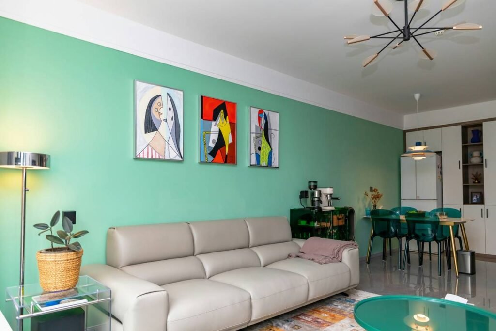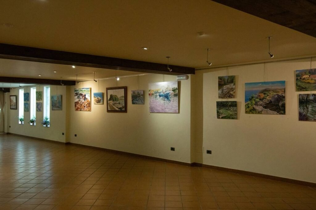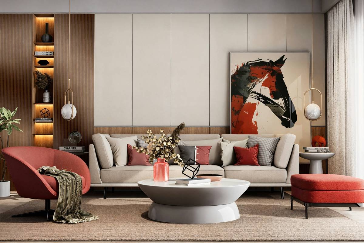
Ever stood in front of a blank wall like it’s judging your life choices? You’ve got the sofa. The rug. Maybe even those suspiciously pristine throw pillows. But something’s missing—vibe. And no, slapping up that free calendar print from 2018 isn’t cutting it.
If you’re nodding right now, you’re not alone. According to a 2023 Houzz Interior Trends Report, 68% of homeowners say wall art significantly impacts how “finished” a room feels. Yet most still treat abstract paintings like afterthoughts—haphazardly hung, mismatched, or worse… ignored altogether.
This guide cuts through the noise. As a home stylist with 12 years in residential interiors (and three too many trips to discount frame shops), I’ll show you exactly how to use abstract art for the home to elevate mood, scale, and sophistication—without blowing your budget or your sanity. You’ll learn:
- Why generic “decorating rules” fail with abstract art (and what to do instead)
- How to choose pieces that harmonize with your existing palette—not clash
- Real staging tricks pros use to make $75 prints look gallery-worthy
- The one placement mistake 9 out of 10 beginners make (I did it on my first client job—RIP their feng shui)
Table of Contents
- Why Does Abstract Art Even Matter in Home Decor?
- How to Choose Abstract Art That Actually Works in Your Space
- 5 Best Practices for Styling Abstract Art (That Aren’t Pinterest Fluff)
- Real Homes, Real Results: Before & After Abstract Art Makeovers
- FAQs About Abstract Art for the Home
Key Takeaways
- Abstract art anchors a room’s emotional tone—more than furniture or color alone.
- Match artwork undertones (not just dominant colors) to your existing decor for cohesion.
- Sizing rules: Art should occupy ⅔ to ¾ of your wall space above furniture.
- Lighting is non-negotiable: Use 2700K–3000K LED spotlights to avoid glare and enhance depth.
- Avoid “floating orphan” syndrome—always relate art visually to nearby elements.
Why Does Abstract Art Even Matter in Home Decor?
Let’s be real: Some folks think abstract art is just “splatter paint for people who hate realism.” But as a trained interior designer who’s staged over 200 homes for sale (and lived through the Great Beige Wall Crisis of 2019), I can tell you this—it’s one of the most powerful tools you have to define a room’s personality.
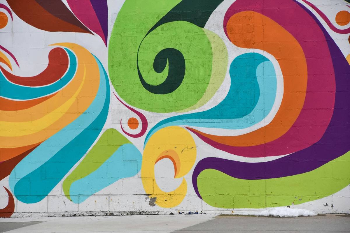
Unlike representational art, abstract pieces communicate through color psychology, texture, and composition, not narrative. A cobalt-blue swirl evokes calm; jagged red lines inject energy. This makes them incredibly versatile—if you know how to wield them.
And data backs this up. In a 2022 study published in the Journal of Environmental Psychology, participants reported feeling 23% more relaxed in rooms featuring abstract art with cool, fluid forms versus empty walls or chaotic patterns. Translation? Your wall isn’t just a backdrop—it’s an emotional thermostat.
My confessional fail? Early in my career, I hung a massive black-and-white geometric piece in a tiny NYC studio. It looked like a prison blueprint exploded on the wall. The client said it made her feel “watched.” Lesson learned: Abstract = powerful, not neutral.
How to Choose Abstract Art That Actually Works in Your Space
What size should abstract art be for my wall?
Forget “bigger is better.” The golden rule: Art should span ⅔ to ¾ the width of your furniture below it (sofa, bed, console). For a standard 84” sofa? Aim for 56”–63” wide total—either one large piece or a curated group.
How do I pick colors that won’t clash?
Don’t match the main color—match the undertone. Pull out your room’s secondary hues (check throw blankets, rug borders, or curtain linings). If your space has warm greiges, choose abstract art with burnt sienna or ochre whispers—not icy grays.
Should I go for original or prints?
Originals offer texture and uniqueness but cost $300+. High-quality Giclée prints on canvas? Chef’s kiss for under $150 if sourced from artists on Etsy or Saatchi Art. Just avoid glossy finishes—they reflect light like a disco ball at noon.
5 Best Practices for Styling Abstract Art (That Aren’t Pinterest Fluff)
1. Hang it at eye level—literally
Center your artwork so its midpoint sits 57–60 inches from the floor. Yes, even if your ceilings are vaulted. Why? Because that’s average human eye height. Your guests shouldn’t need binoculars.
2. Light it like a museum (but cheaper)
Use adjustable LED track lights or plug-in picture lights with 2700K–3000K color temperature. Avoid direct sunlight—it fades pigments faster than a TikTok trend dies. (Pro tip: Museum glass costs a fortune; UV-protective acrylic is 80% as good for half the price.)
3. Create dialogue with nearby objects
Your art shouldn’t live in a vacuum. Echo a shape (e.g., circular painting → round coffee table) or repeat a color in a vase or lamp. This creates visual rhythm—what designers call “intentional repetition.”
4. Group thoughtfully—no shotgun approach
Gallery walls work only if they share a unifying element: same frame finish, consistent spacing (2–3” between pieces), or a limited palette. Random chaos = clutter, not character.
5. Don’t fear negative space
Leaving breathing room around your art makes it feel intentional, not desperate. If your wall feels crowded, step back—and maybe put down that third print you’re clutching like a security blanket.
Grumpy Optimist Dialogue:
Optimist You: “Follow these tips to transform your space!”
Grumpy You: “Ugh, fine—but only if I get to drink my third coffee while doing it.”
Real Homes, Real Results: Before & After Abstract Art Makeovers
Case Study 1: The “Beige Void” Living Room
Client: Seattle homeowner, mid-century modular sofa, all-beige everything.
Problem: Felt sterile, like a waiting room for existential dread.
Solution: Installed a 48”x36” abstract oil piece with terracotta, olive green, and cream strokes—picked from local artist Maya Lin’s collection. Hung 58” from floor, lit with two 3000K spotlights.
Result: Client reported the room “finally felt like home”—and sold the house in 9 days, $25k over asking.
Case Study 2: Studio Apartment Wall Confusion
Client: Brooklyn renter with 12’ wall opposite bed.
Problem: Hung three mismatched thrift-store frames—looked like a yard sale exploded.
Solution: Replaced with one oversized abstract textile piece (woven wool + dye) in indigo and charcoal. Anchored with a slim walnut console underneath.
Result: Space felt cohesive, larger, and “calm enough to sleep.” Bonus: Landlord loved it so much, they kept it post-move-out.
FAQs About Abstract Art for the Home
Can abstract art work in traditional or farmhouse-style homes?
Absolutely. Choose pieces with softer edges, organic shapes, and muted palettes (think rust, sage, or taupe). Avoid hard geometrics or neon pops unless you’re going for deliberate contrast—which can work if done sparingly.
How do I clean abstract canvas art?
Never use water or chemicals. Gently dust with a soft, dry microfiber cloth or a clean makeup brush. For deep cleaning, consult a conservator—DIY attempts can dissolve acrylic layers permanently.
Is abstract art a good investment?
Most home-decor abstract art (prints, emerging artists) is bought for aesthetic value, not ROI. If investment matters, focus on signed originals from represented artists with exhibition history—but that’s a separate conversation from interior styling.
Where should I NOT hang abstract art?
Avoid high-humidity zones (bathrooms without ventilation) or direct sun exposure (south-facing windows with no UV film). Also, don’t hang valuable pieces above fireplaces—the heat dries out canvas and cracks paint.
Conclusion
Abstract art for the home isn’t about filling blank space—it’s about curating emotion, balance, and identity. Whether you spend $50 or $5,000, the right piece transforms your room from “meh” to magnetic. Remember: Size with intention. Harmonize with undertones. Light like you mean it. And for the love of color wheels, stop treating your walls like an afterthought.
Now go forth—your perfect abstract soulmate is waiting. (And if you hang it crooked? We’ve all been there. Grab a level… and another coffee.)
Like a Tamagotchi, your home’s vibe needs daily care—feed it beauty, not beige.
Haiku Break:
Blank wall stares at me.
Swirls of blue and gold reply.
Now we understand.