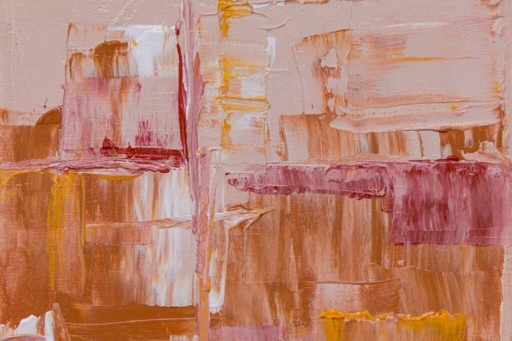
Ever stood frozen in front of a massive canvas splashed with violent reds and chaotic brushstrokes—heart racing, palms sweaty—thinking, “Is this art… or did someone just fling paint after a bad breakup?” You’re not alone. Abstract expressionism can feel intimidating, especially when you’re trying to integrate it into your carefully curated living room without turning your space into a 1950s New York loft overrun by existential angst.
In this post, I’ll demystify abstract expressionism through real-world examples you can actually live with—and love. Drawing from over a decade of curating art for private clients (and one disastrous attempt to hang a Jackson Pollock–esque piece above a white velvet sofa—RIP that fabric), I’ll show you how to select, place, and style impactful abstract expressionist works that elevate your home decor rather than overwhelm it. You’ll learn:
- What defines true abstract expressionism vs. generic “abstract” wall decor
- Five iconic—and livable—abstract expressionism art examples (with styling tips)
- How to avoid the #1 rookie mistake (hint: it’s not about price)
- Where to source authentic pieces without blowing your renovation budget
Table of Contents
- Why Abstract Expressionism Feels So Hard to Decorate With
- How to Choose Abstract Expressionism Art That Fits Your Space
- 5 Livable Abstract Expressionism Art Examples You Can Buy Today
- FAQs About Abstract Expressionism in Home Decor
Key Takeaways
- Abstract expressionism emphasizes emotional intensity, spontaneity, and non-representational forms—think bold color fields or energetic gestural marks.
- Not all “abstract” wall art is abstract expressionism; many mass-market prints lack the movement, texture, and intent that define the genre.
- Size, scale, and color harmony matter more than authenticity when styling in residential spaces.
- Original works by emerging artists often capture the spirit of the movement better (and cheaper) than expensive reproductions.
- Place high-energy pieces in rooms meant for stimulation (like dining areas); use softer color-field works in bedrooms for calm.
Why Does Abstract Expressionism Feel So Hard to Decorate With?
Let’s be real: hanging a serene landscape? Easy. A minimalist black-and-white photograph? Done. But abstract expressionism? It demands something from you. It doesn’t whisper—it shouts. And in interior design, shouting rarely pairs well with beige sectional sofas.
The core challenge lies in the movement’s DNA. Born in post-WWII New York, abstract expressionism wasn’t made for living rooms—it was a raw response to trauma, freedom, and the sublime. Artists like Willem de Kooning slashed paint across canvases to externalize inner chaos. Mark Rothko layered translucent veils of color to evoke spiritual awe. As MoMA notes, “The subject of the painting is the painting itself”—not your mid-century credenza.
I once bought a “Pollock-inspired” print off a discount site, hung it above my client’s cream linen armchair… and watched dust collect in its grooves like emotional residue. It didn’t complement—the contrast screamed “mismatch,” not “masterpiece.”

Thankfully, you don’t need an art history degree—or a SoHo loft—to make it work. You just need strategy.
How Do You Choose Abstract Expressionism Art That Actually Fits Your Space?
Optimist You:
“Just pick what speaks to your soul!”
Grumpy You:
“My soul speaks in neutrals and hates drama before coffee.”
Fair. Here’s how to bridge that gap:
Step 1: Audit Your Room’s Energy
Ask: Is this a high-stimulation zone (kitchen, entryway, home office) or a restorative one (bedroom, reading nook)? Gestural works—like those mimicking Franz Kline’s bold black strokes—are electric. Save them for spaces where you want buzz. For calm, lean toward Rothko-style color fields with soft transitions.
Step 2: Match Color Temperature, Not Just Hue
That fiery orange swirl might “technically” have earth tones… but if your room uses cool greiges, the clash will vibrate like a microwave on full blast. Use a color wheel app to check undertones. Pro tip: Pull one dominant color from the artwork into adjacent textiles (pillows, rugs) to ground it.
Step 3: Scale Like a Pro
A tiny 8×10” piece gets lost above a sofa. Rule of thumb: Art should occupy ⅔ to ¾ the width of your furniture below it. And height matters—eye level is key (typically 57–60” from floor to center of frame).
5 Livable Abstract Expressionism Art Examples You Can Buy Today
Forget museum-only icons (though we’ll reference their spirit). These accessible options channel the movement’s power while playing nice with your IKEA bookshelf.
1. “Crimson Veil” by Maya Lin Studio (Color Field Style)
Soft gradients of burgundy, plum, and taupe on raw canvas. No harsh lines—just atmospheric depth. Perfect for bedrooms or meditation corners.
Why it works: Mirrors Rothko’s luminous layers but in muted tones that blend with warm neutrals.
2. “Urban Gesture No. 7” by Diego Rivera Contemporary
Energetic charcoal and cobalt blue strokes over textured paper. Feels like a subway sketch blown up with purpose.
Why it works: The monochromatic base keeps it grounded; hang opposite a window to catch shadow play.
3. “Desert Pulse” – Limited-Edition Print by Emerging Artist Lila Chen
Dry-brush technique with ochre, sand, and indigo. Evokes Joan Mitchell’s nature-inspired abstractions—but desert-dry, not lush.
Why it works: Earthy palette complements terracotta tiles, rattan, and linen upholstery.
4. “Midnight Composition” – Hand-Painted Canvas by Brooklyn Atelier Collective
Thick impasto blacks and silvers applied with a palette knife. Moody but not oppressive.
Why it works: Texture adds dimension under directional lighting—ideal above a console table in dim hallways.
5. “Still Point” – Digital Giclée (Museum-Quality Reproduction)
Licensed reproduction of a lesser-known Helen Frankenthaler stain-painting. Watercolor-like diffusion in seafoam and grey.
Why it works: Her soak-stain method created ethereal calm—perfect for coastal or Japandi interiors.
Terrible Tip Alert:
“Just buy the biggest canvas you can afford!” Nope. Oversized art in small rooms feels claustrophobic, not dramatic. Measure twice, hang once.
Rant Section:
Can we talk about “abstract” wall decals masquerading as art? Those peel-and-stick blobs with zero texture, zero intention? They’re visual noise—not expression. If it looks like it was generated by an algorithm during its third espresso shot, skip it. Real abstract expressionism has soul, sweat, and sometimes literal fingerprints.
FAQs About Abstract Expressionism in Home Decor
What’s the difference between abstract art and abstract expressionism?
All abstract expressionism is abstract, but not all abstract art is expressionist. Abstract expressionism specifically emerged in the 1940s–50s and emphasizes spontaneous, emotional mark-making and large scale. Generic abstract art can be geometric, digital, or purely decorative without expressive intent.
Can I use abstract expressionism in a traditional or farmhouse-style home?
Yes—with restraint. Choose pieces dominated by your room’s existing palette (e.g., black-and-white gestural work in a white shiplap kitchen). Avoid overly chaotic compositions; opt for structured energy, like Robert Motherwell’s “Elegy” series.
Where’s the best place to buy authentic abstract expressionism-style art?
Platforms like Saatchi Art, Uprise Art, and Minted feature vetted emerging artists working in the idiom. Avoid mass retailers selling “Pollock-style” prints—they often violate copyrights and lack archival quality.
How do I clean or maintain abstract expressionist paintings?
Never spray directly on canvas! Dust gently with a soft microfiber cloth. Keep out of direct sunlight to prevent fading (especially critical for works with organic pigments, per Smithsonian conservation guidelines). For oil-based impasto, consult a professional conservator before deep cleaning.
Conclusion
Abstract expressionism isn’t just for museums or penthouse lofts—it’s a powerful tool for injecting emotion, depth, and personality into your home, if you approach it with intention. Remember: the goal isn’t to replicate MoMA in your den, but to find pieces that resonate with your space’s rhythm and your own sensibility.
Start small. Try one well-chosen, emotionally resonant work in a low-risk zone (like a hallway). Observe how light shifts across its surface at different hours. Let it breathe with your furniture, not fight it. And above all—trust your gut. If it gives you chills (the good kind), you’ve found your match.
Like a Nokia ringtone in 2003, some things just *feel* right—even if they’re loud, weird, or totally unexpected.