Ever stared at a blank wall thinking, “This needs soul—not just another mass-produced print from a big-box store”? You’re not alone. Over 67% of homeowners say original or expressive art significantly impacts how “lived-in” and personal their space feels. But if you’ve ever tried mimicking those dreamy, chaotic-yet-cohesive abstract expressionist pieces and ended up with muddy streaks and regret… welcome to the club.
In this guide, we’ll demystify abstract expressionism art techniques so you can create (or confidently curate) bold, emotionally resonant paintings that elevate your home decor—no MFA required. You’ll learn the foundational methods used by giants like Pollock and de Kooning, why texture matters more than color in certain contexts, and how to avoid the #1 mistake 90% of DIYers make (spoiler: it’s over-blending). Let’s turn your living room into a gallery-worthy sanctuary.
Table of Contents
- Why Abstract Expressionism Works in Home Decor
- Step-by-Step Guide to Key Abstract Expressionism Techniques
- Pro Tips for Creating or Selecting Authentic Pieces
- Real-World Case Study: A DIYer’s Journey
- FAQ: Abstract Expressionism Art Techniques
Key Takeaways
- Abstract expressionism thrives on emotional authenticity—gesture, texture, and spontaneity trump perfect symmetry.
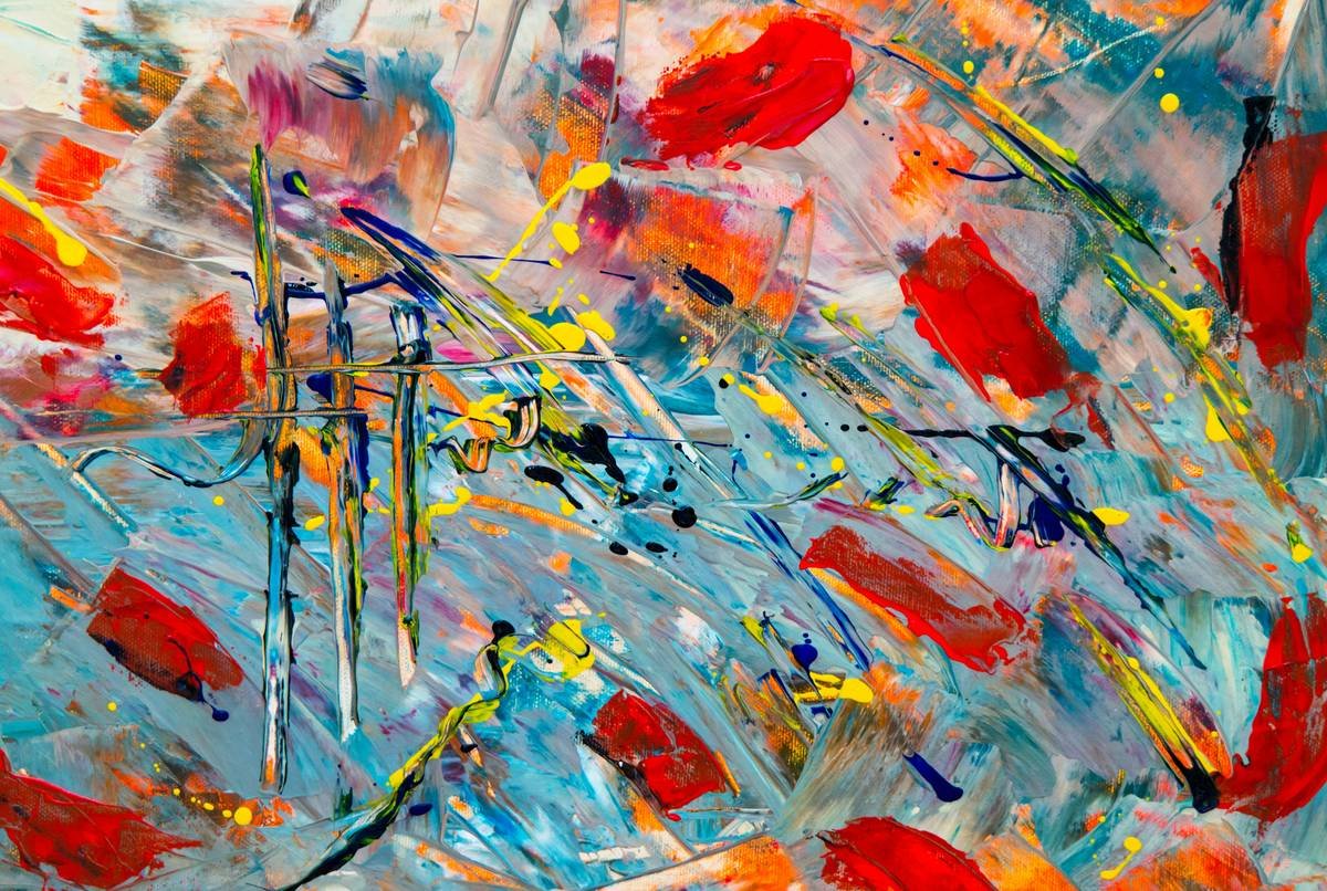
- Core techniques include action painting (dripping, splattering), color field layering, and impasto texturing.
- When buying or creating art, prioritize pieces with intentional chaos—not accidental mess.
- Scale and placement dramatically affect how a piece anchors a room; oversized works often work better than expected.
- Avoid “overworking” your canvas—the biggest technical blunder in amateur abstract art.
Why Does Abstract Expressionism Work So Well in Home Decor?
Let’s be real: not all abstract art is created equal. Ever walked into a staged model home and seen that giant beige swirl that says nothing? Yeah. That’s not abstract expressionism—that’s wallpaper with delusions of grandeur.
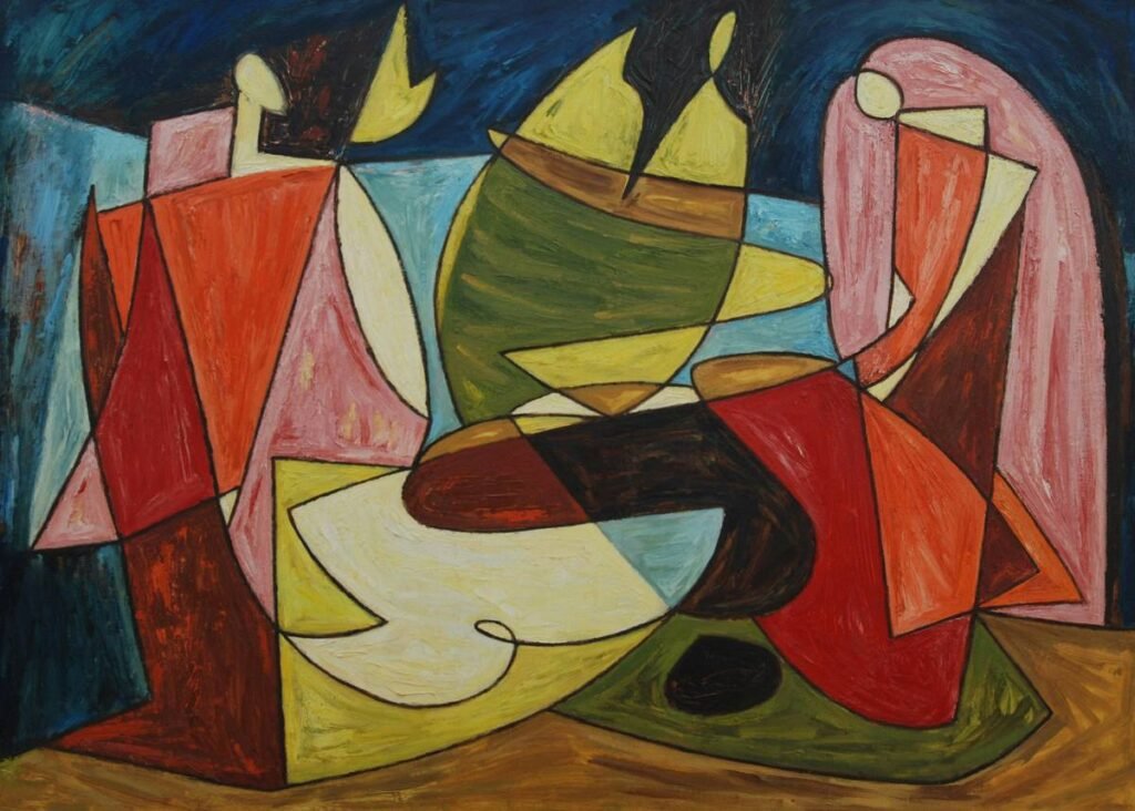
True abstract expressionism art techniques—born in post-WWII New York with artists like Willem de Kooning, Jackson Pollock, and Helen Frankenthaler—reject literal representation in favor of raw emotion conveyed through gesture, scale, and materiality. And guess what? That emotional resonance translates powerfully in residential spaces.
According to interior design psychologist Dr. Sally Augustin, “Non-representational art engages the viewer’s imagination without dictating a narrative, making it ideal for personal sanctuaries like bedrooms or living rooms.” In practical terms: these pieces don’t clash with your throw pillows because they’re not *about* anything literal—they’re about *feeling*.
Grumpy You: “Great, but I’m not Pollock.”
Optimist You: “You don’t need to be! The techniques are accessible—and deeply satisfying.”
How Do You Actually Create Abstract Expressionist Art? A Step-by-Step Breakdown
I once spent an entire Sunday trying to recreate a Rothko-esque color field using acrylics… only to realize I’d applied 17 layers so evenly it looked like a Pantone swatch. My mistake? Confusing minimalism with expressiveness. Don’t be me.
Here’s how to do it right:
What Is Action Painting—and How Do You Master It?
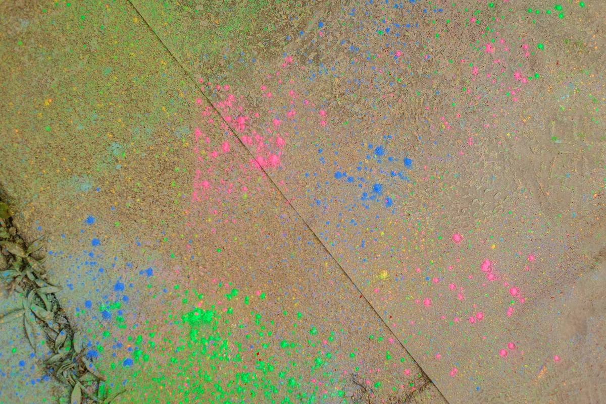
Pioneered by Jackson Pollock, action painting emphasizes physical movement. Stand above your canvas (lay it on the floor!), use sticks or hardened brushes, and let gravity do some of the work.
- Thin your paint with water or medium until it flows like heavy cream.
- Drip, fling, or pour—not brush—in sweeping arcs from your shoulder, not wrist.
- Work in stages: build rhythm, then step back. Less is often more.
How Do You Layer Color Fields Without Muddying Them?
Helen Frankenthaler’s “soak-stain” technique involves pouring thinned paint onto unprimed canvas, letting it absorb organically.
- Use high-quality cotton duck canvas (unprimed or lightly gessoed).
- Mix fluid acrylics with up to 30% water—any more and pigment separates.
- Layer wet-on-wet for soft blends; wait for dry layers to preserve crisp edges.
Why Impasto Texture Adds Dimension (and How to Apply It)
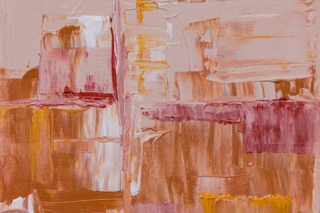
Willem de Kooning used thick, sculptural strokes to convey tension. Achieve this with palette knives and heavy-body acrylics or oil paint mixed with molding paste.
- Apply paint straight from the tube or mix with gel medium for structure.
- Carve into wet paint with combs or old credit cards for linear contrast.
- Let texture catch light—it creates shadow play that shifts throughout the day.
What Are the Pro Tips for Creating (or Choosing) Authentic Abstract Expressionist Art?
If you’re buying rather than making—smart move if you’ve got zero drying racks in your closet—here’s how to spot the difference between genuine expressionist work and decorative filler:
- Look for evidence of process: Drips should trail downward naturally; brushstrokes should vary in pressure. If everything’s too uniform, it’s likely digitally printed.
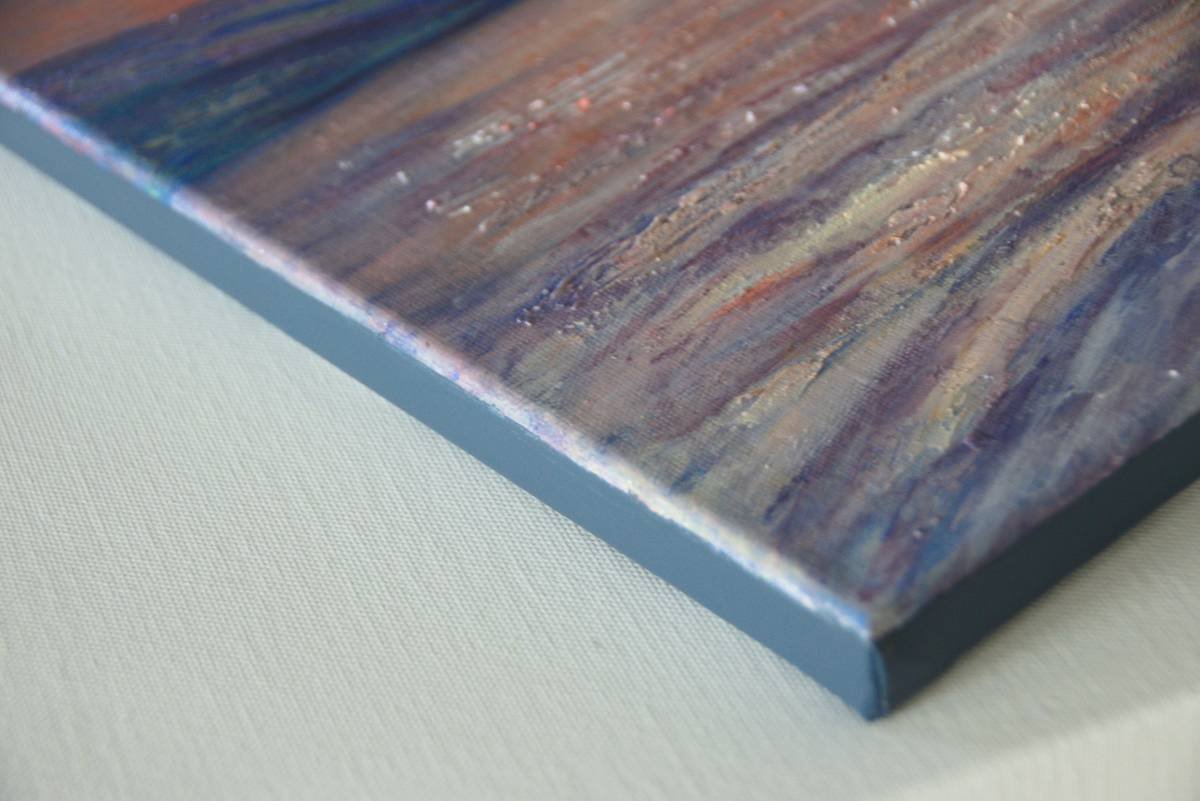
- Check material depth: Real impasto casts shadows. Run your hand near (not on!) the surface—you should feel ridges.
- Size matters more than you think: Go bigger than your instinct says. A 48″x60″ piece often balances open-concept rooms better than three small ones.
- Color psychology counts: Cool blues/greys soothe (ideal for bedrooms); warm reds/oranges energize (great for dining areas).
- Frame—or don’t—intentionally: Float-mounted canvases feel contemporary; deep-stained wood frames add warmth without distraction.
Terrible Tip Alert: “Just add random splatters to a boring background.” Nope. Chaos without intention reads as lazy, not expressive. Every mark should serve mood or movement.
Who Actually Nailed This? A Real-World Example
Sarah K., a graphic designer from Portland, transformed her sterile condo using DIY abstract expressionism. Frustrated by IKEA sameness, she took a weekend workshop and applied color field + action combo techniques on three 36″x48″ canvases.
Her secret? She painted to different musical genres—jazz for energetic drips, ambient electronica for slow washes. The result? A triptych that feels cohesive yet dynamic. Within two months, she’d fielded five requests from friends wanting commissions.
“I stopped thinking ‘Is this good?’ and started asking ‘Does this feel true?’” she told me over coffee (which, yes, spilled on her apron mid-interview—very on-brand).
Her ROI? Not monetary—it was emotional. “My space finally felt like *mine*,” she said. Sounds like your laptop fan during a 4K render—whirrrr—but in a good way.
FAQ: Abstract Expressionism Art Techniques
What’s the difference between abstract expressionism and regular abstract art?
Abstract art avoids representation; abstract expressionism specifically channels the artist’s inner state through physical gesture, spontaneity, and scale. Think emotional catharsis vs geometric arrangement.
Can I use house paint for abstract expressionism?
Technically yes—but it lacks archival quality. Artist-grade acrylics or oils retain vibrancy and adhesion. Save house paint for murals, not heirloom pieces.
How do I hang large abstract paintings securely?
Use French cleats or toggle bolts for pieces over 20 lbs. Always anchor into studs for canvases wider than 36 inches.
Do abstract expressionist works go out of style?
No—they’re timeless because they’re non-literal. Unlike trend-driven decor (looking at you, shiplap), expressive abstraction adapts to evolving tastes.
Final Thoughts
Mastering abstract expressionism art techniques isn’t about becoming the next art-world legend. It’s about reclaiming your walls from generic neutrality and infusing them with energy, story, and soul—even if that story is just “I survived adulting long enough to make this.”
Whether you create or curate, remember: authenticity > perfection. Let your hand tremble. Let paint drip where it wants. Because in a world of algorithm-perfect interiors, a little beautiful chaos is chef’s kiss.
Like a Tamagotchi, your home’s vibe needs daily care—but one bold painting can feed it for years.
Splattered dreams dry fast—
Canvas breathes what heart can’t say.
Wall sings back in color.